Data & Analytics · 2026
Road Accident Data Analysis
The Problem
A dataset of over 152,000 road accidents needed to be turned into something road safety authorities could actually act on, rather than a raw table of numbers.
The Approach
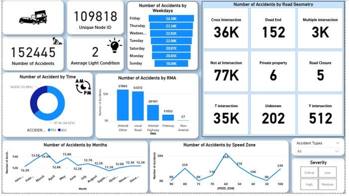
I built an interactive Power BI dashboard breaking the data down by time of day, day of week, month, speed zone, road geometry, and severity, so patterns that would be invisible in a spreadsheet became immediately visible.
Implementation
The dashboard includes a KPI summary (total accidents, unique locations, average light condition), a time-of-day breakdown showing a clear night versus day split, a weekday and monthly trend analysis, a road geometry breakdown by intersection type, and a severity classification, with a slicer allowing filtering by accident type.
Result
The analysis surfaced clear, specific patterns: 64% of accidents occurred at night, Fridays through Wednesdays saw the highest accident counts, March was the peak month, and the 60 km/h speed zone recorded the highest accident volume. Each finding was paired with a specific, actionable recommendation, such as improved nighttime lighting and stricter speed enforcement in the 60 km/h zone.
Lessons Learned
Working with a dataset this large reinforced that the hardest part of data analysis isn't calculating the numbers, it's deciding which breakdowns actually reveal something useful, rather than just producing more charts.